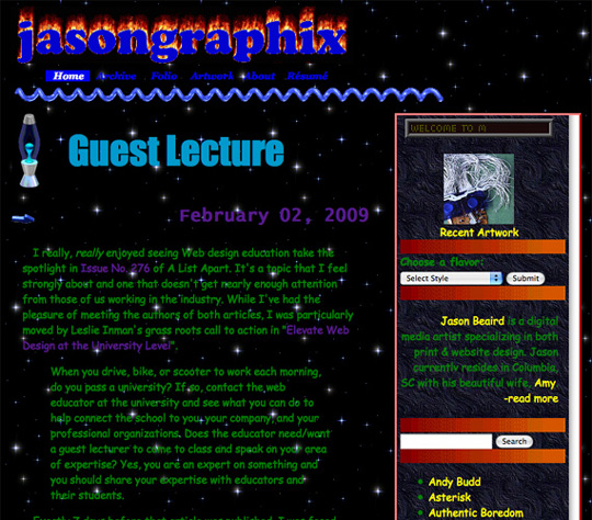
Back in the early days of the Web, a lot of UI decisions were made on the fly, often having completely different sources of inspiration. There were few boundaries set: no pattern libraries, no widely-used design systems, pixelated raster graphics, and distracting Flash-based animations.
Users were thrilled to see new crazy ideas realized. Floating flashing navigation, moving text, animated logos. Sometimes there was even an instruction page to teach users how to use the website’s interface. There was no such thing as usability and couldn’t be at that level of UX competence. This approach is now seeing a comeback in the form of brutalist design as a form of pushback to today’s sterile and uniform design patterns.
Design Standards Evolved
As time progressed in the evolution of experience design, two things happened:
- The average internet user’s expectations rose. They began to notice websites that were easier to use and were more visually appealing.
- Designers began to understand what elements worked better and they started to reuse patterns within their organizations and “borrow” patterns from other successful companies.
Every modern website is first of all a solution to the user’s problem. The faster user would get what to click and scroll to get his desire fulfilled, the more chance that he would stay and wouldn’t go to a competitor. The design has to offer users attributes they find familiar such as affordances: Immediately recognizable real-world features such as buttons should instantly help users understand what to do. Sure, it’s way complicated than that, but poor usability is one of the main bounce factors. If we skip the marketing and branding aspects of the website, it’s redundant – the best interface is invisible.
Generally speaking, unification is good, because it improves UX and sets clear expectations for a user however when everything is predictable and similar nothing stands out, and it becomes increasingly harder to distinguish brands, products, and services.
Establishing Global UI Unification
The first global web unification project was started in 2011 by Google, and in 2014 Material Design was introduced.
Material Design doesn’t just create order, it creates order with purpose and meaning. It became one of the most influential visual philosophies in design, shaping the way people see and interact with interfaces.
How Big Companies Drive Trends
Google has a massive influence on how users interact with digital services and the Web. After all, 87 percent of internet users use Google products. Another major influencer is Apple with its Human Interface Guidelines for all of the products. Every time they change the design of their products, they trigger changes for the entire design landscape: Everyone strives to follow their decisions.
A follow-the-leader strategy often makes sense. They dictate the trend not only because of their design innovation but also because of their dominance in the market and large loyal customer base. Moreover, with Apple App Store growth they set the guidelines for apps and shape their visual identity.
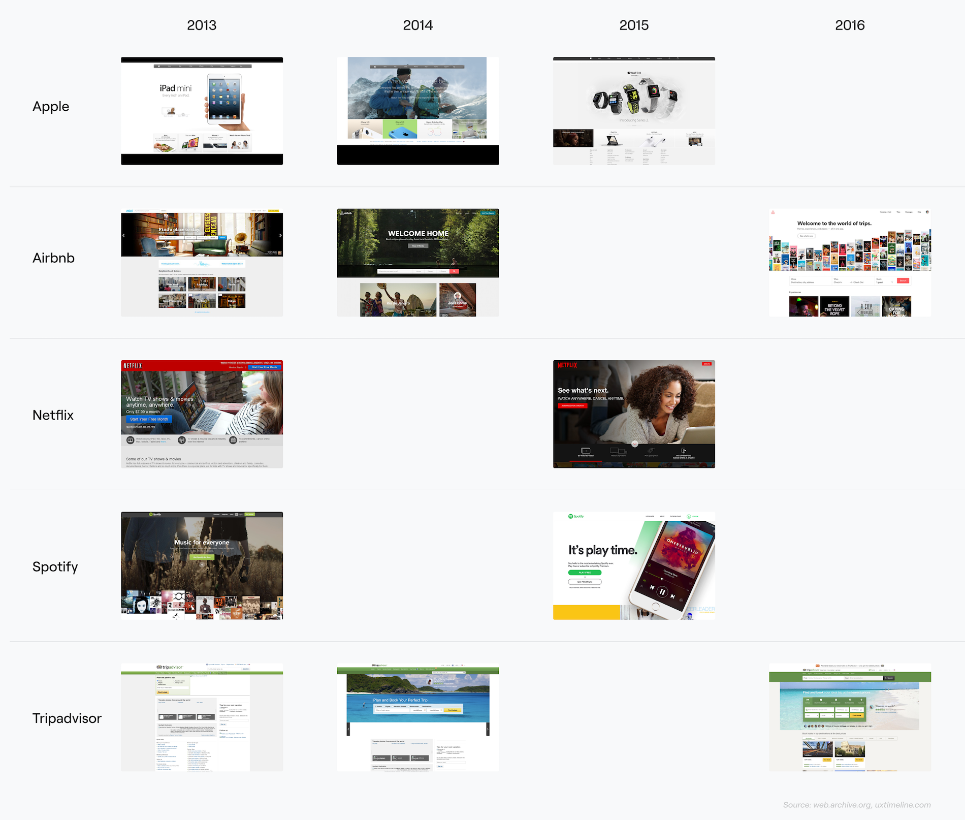
When Apple unveiled iOS 7 in 2013, it introduced a new flat design that threw out the idea that apps should use a skeuomorphic design and instead use flat colors, comprised of different layers. Later it has become increasingly clear that iOS 7 was about much more than a visual refresh, it was a different design vision.
At that time there was a lot of talk about design influences in the newly presented iOS: some components were looking too similar to ones from Windows Phone, Nokia, Android, and Blackberry OS. But trying to boil it down to who stole from whom misses the point. Design is a language that evolves not in a vacuum but with the input of other voices. That’s how these design conversations work—they’re back and forth, they’re circular. They tend to converge.
Aside from corporate trends and new releases, there also some other more universal reasons for this unification process.
Web-services as object systems
Users spend more and more time on social media. These apps become a layer between users and content. In this relation, it seems logical, that the cognitive load of the social media interface itself decreases.
Social media is not just an app or website, it’s the ecosystem of objects (photos, videos, commentaries, groups, etc) that are aggregated in different layouts in the form of a feed or page. It’s not important on which platform the content is published on, whether it’s a smartwatch or a desktop app – their relations stay the same. The interface plays a secondary role there.
Globalization
The Internet erodes cultural differences and forms a new global style without any foundation or unique national heritage. Before that, design and dominant visual styles were following the arts and spirit of the decade. Now global trends are being set by large global corporations and user’s expectations are becoming more and more functional.
Visual asceticism as a global trend
User cognitive load decreases with increased unification – that’s the trend. Everything becomes simpler and more flexible. The modern Web is soft and friendly. Interfaces tend to be pastel-colored, with rounded corners and soft shadows.
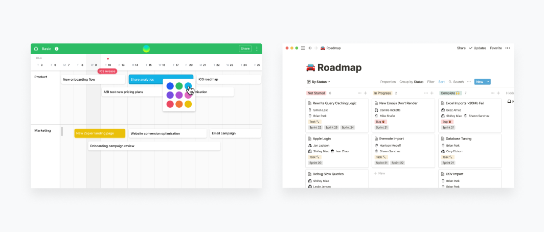
Animoji from Apple, as well as the current trend for bright 3D objects and characters, makes the design even more toy-like. In such an environment, interaction with even complex, not always exciting tasks becomes more pleasant. Take a look at the Roadmap, Notion, and Airtable interfaces and you can see what I’m talking about. It’s part of a larger product design trend.
The approach is to make products more attractive and friendly while maintaining the same set of functions. Modern tablets have many more sets of functions and computing power than older desktops, yet even kids are using them from the earliest ages. The form has changed, it’s more accessible and even charming now.
Unfamiliar patterns often bring dissatisfaction
The user always has expectations in the form of mental models about how their interaction with a system will be. And if instead of the usual patterns, the user is met with something completely unexpected, the result is often dissatisfaction. And the point is not that the new design paradigm is necessarily bad, but that the user will have to spend additional resources to understand the new interface. Any redesigns and major updates will perfectly illustrate this.
The invisible user interface
Not every website or app experience needs to be memorable. Many applications use standard UI components and design elements that are extremely familiar to users. The user doesn’t need to think about how to use the interface, and probably doesn’t even really notice it at all. This allows the person to focus on using the system effectively to complete tasks quickly and easily.
However, for a company and a brand experience to stand out from the vast array of competitors, businesses still need differentiation.
The ability to play on differences
An extreme type of design differentiation comes in the form of brutalism. Like minimalist design, brutalism derives from an earlier architectural movement. Aesthetic websites reject the fine-tuned and universal structures that have become ubiquitous. They contain bold, not always intuitive visual solutions and an emphasis on bright and unusual typography. Aesthetically and functionally, web brutalism can trace its roots back to the mid-1990s. At a time when web interfaces were much less influenced by pattern-based design and functionality, as we discussed early on.
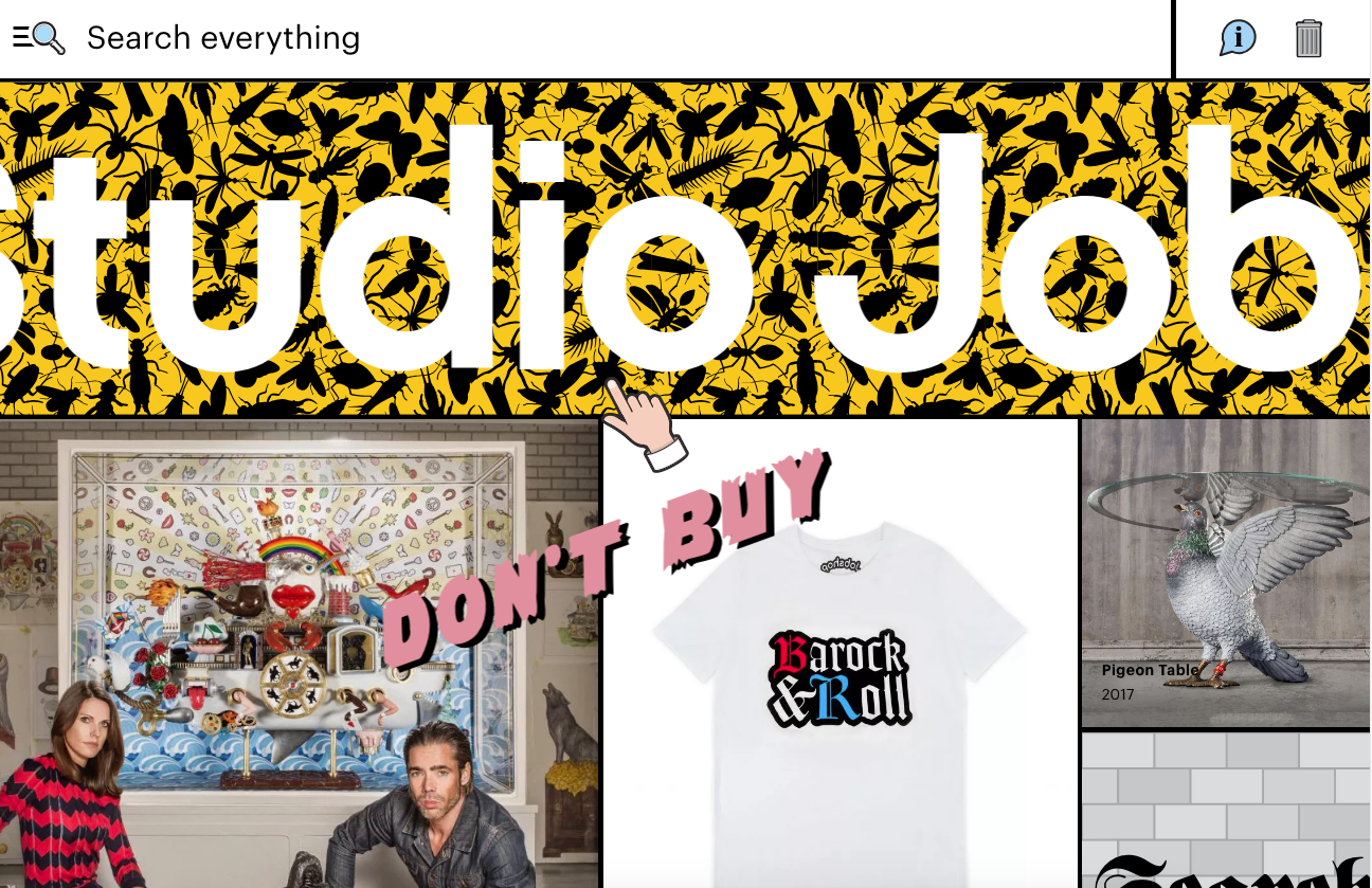
Brutalist websites are designed to be rude, raw, and deliberately sloppy. When faced with a site like this, the user is likely to have a strong and justifiable emotional reaction. This style can be delightful or repellent – as well as other strong deviations from user expectations. This can both strengthen the emotional connection with the user, and vice versa – alienate him.
Design unification is a sign of progress – the Web has become more accessible, friendly, and structured. A set of standardized patterns makes it possible to pay more attention to user tasks instead of reinventing the wheel. Both users and companies benefit from that – high-quality consistent components make communication easier.
At the same time, when every product and experience looks the same, we risk making them bland and uninteresting. Design is about communication and impact, and there’s a little impact when everything is the same.
The right strategy is to pay attention to longer-term design trends as well as what’s happening right now. Perhaps within the current monotonous landscape is the great opportunity to create a new unique yet familiar user experience.