Velocity
Timeline
2018
My Role
Product & Visual Design, Branding
Contributors
- Cosmin Trufasila, Aaron Stump
Press mentions
- Muzli, Product Hunt, Abuzeedo
A responsive dashboard UI kit & design system
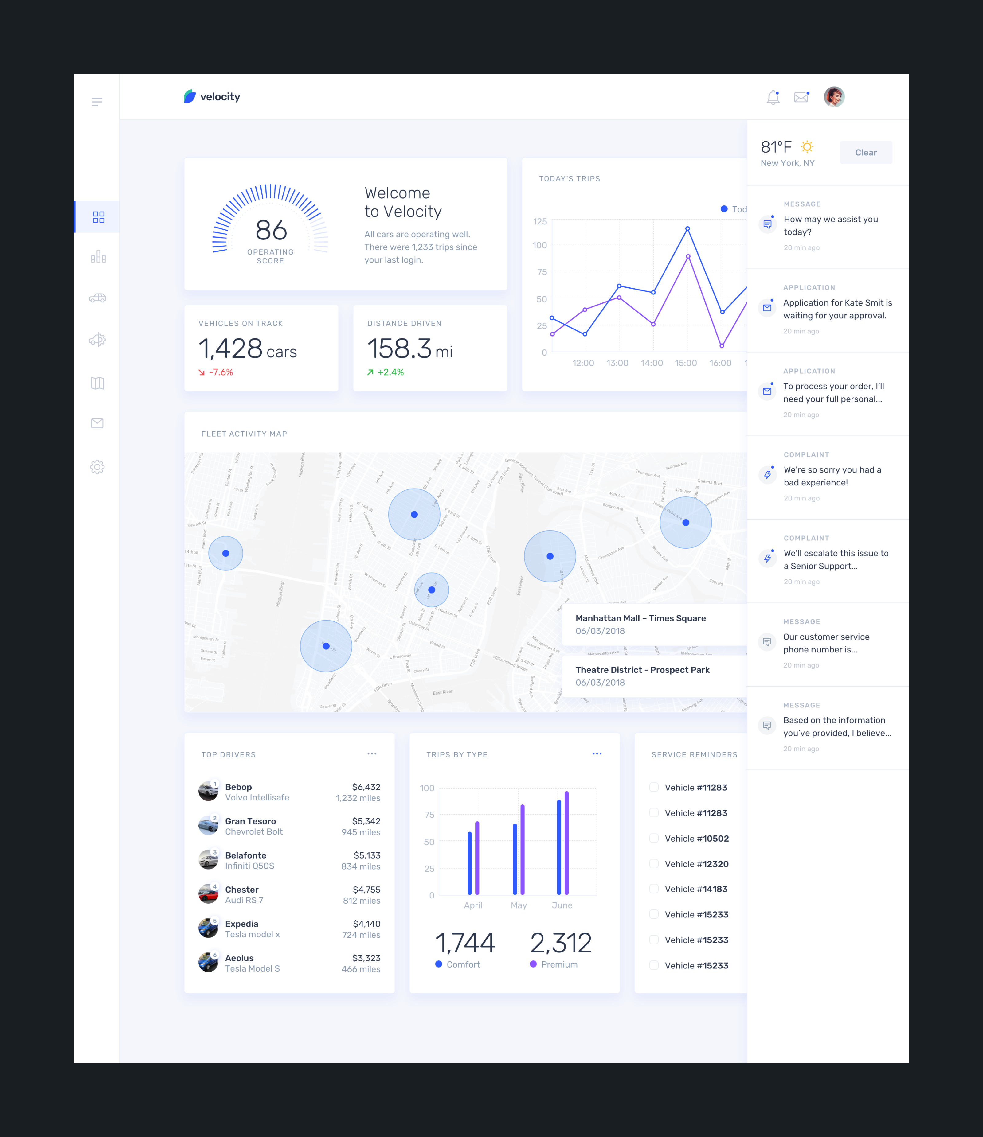
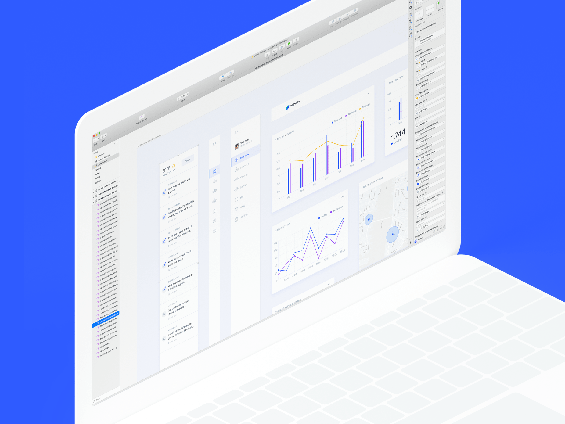
When InVision reached back to me with another UI kit inquiry, I was really hyped. This time we wanted not just to make a responsive UI kit, but a highly customizable design system. At that time Sketch just rolled their new features for a better design system organizing – it was a good opportunity to try out the new features.
Borrow, remix, and remake
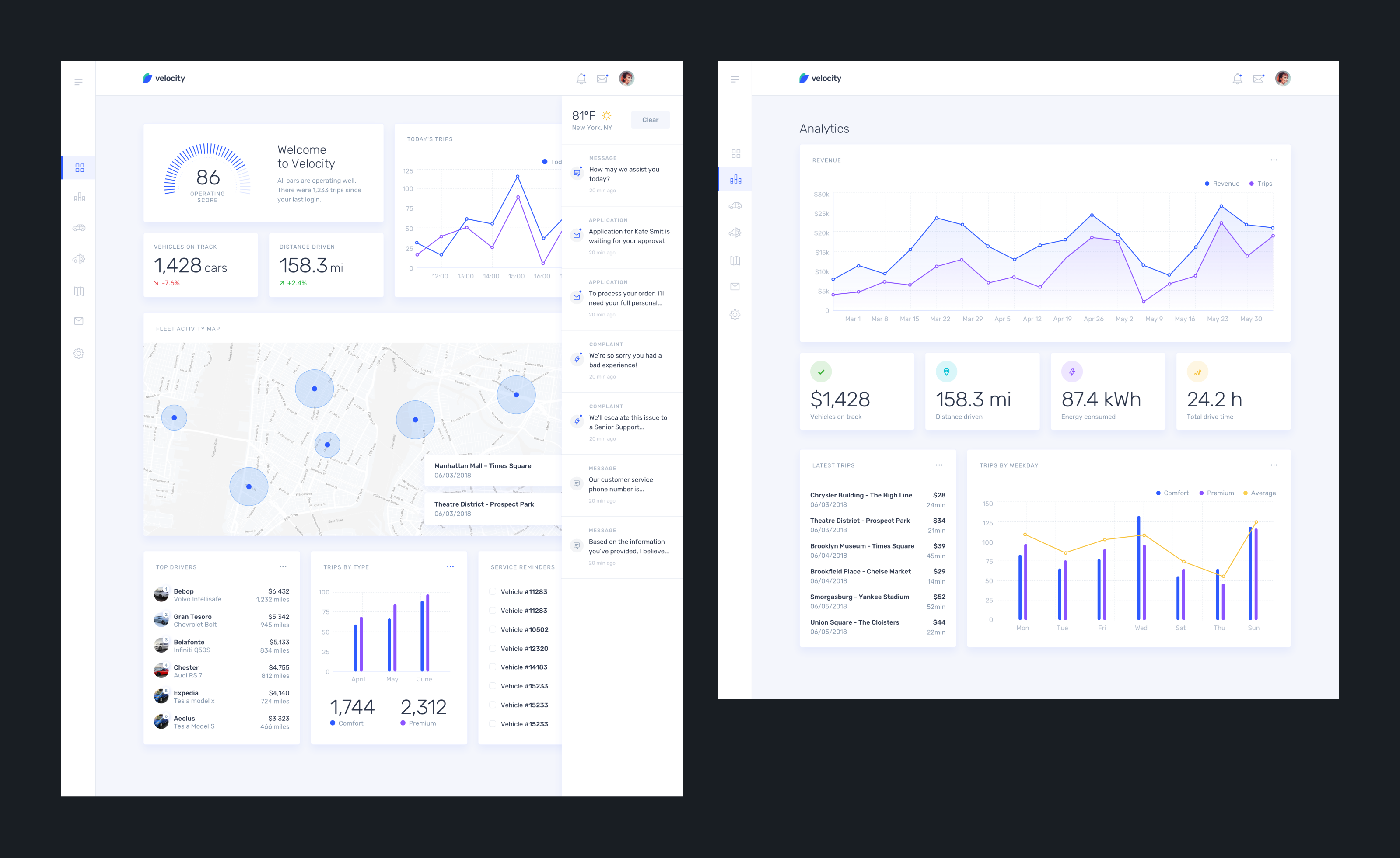
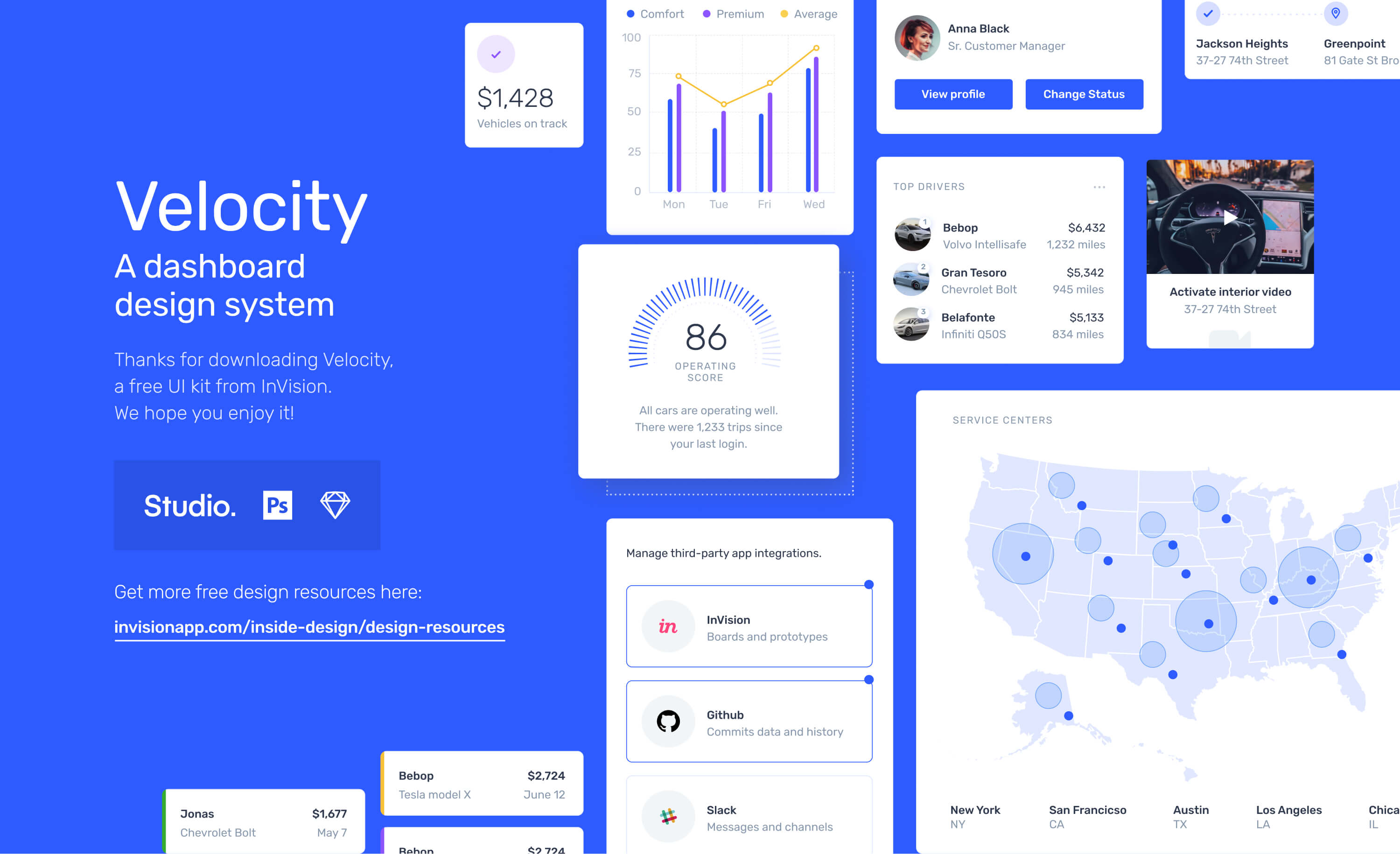
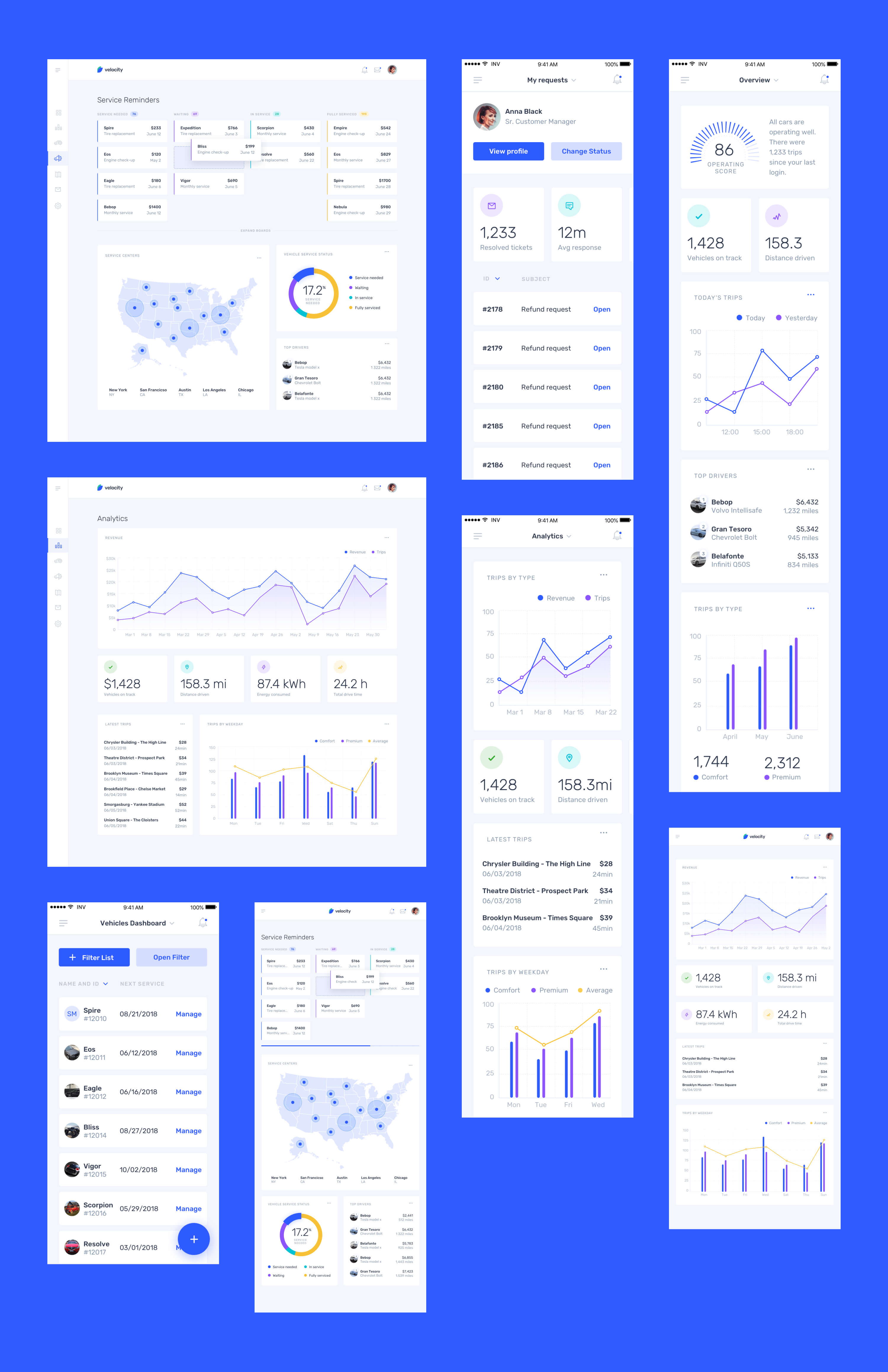
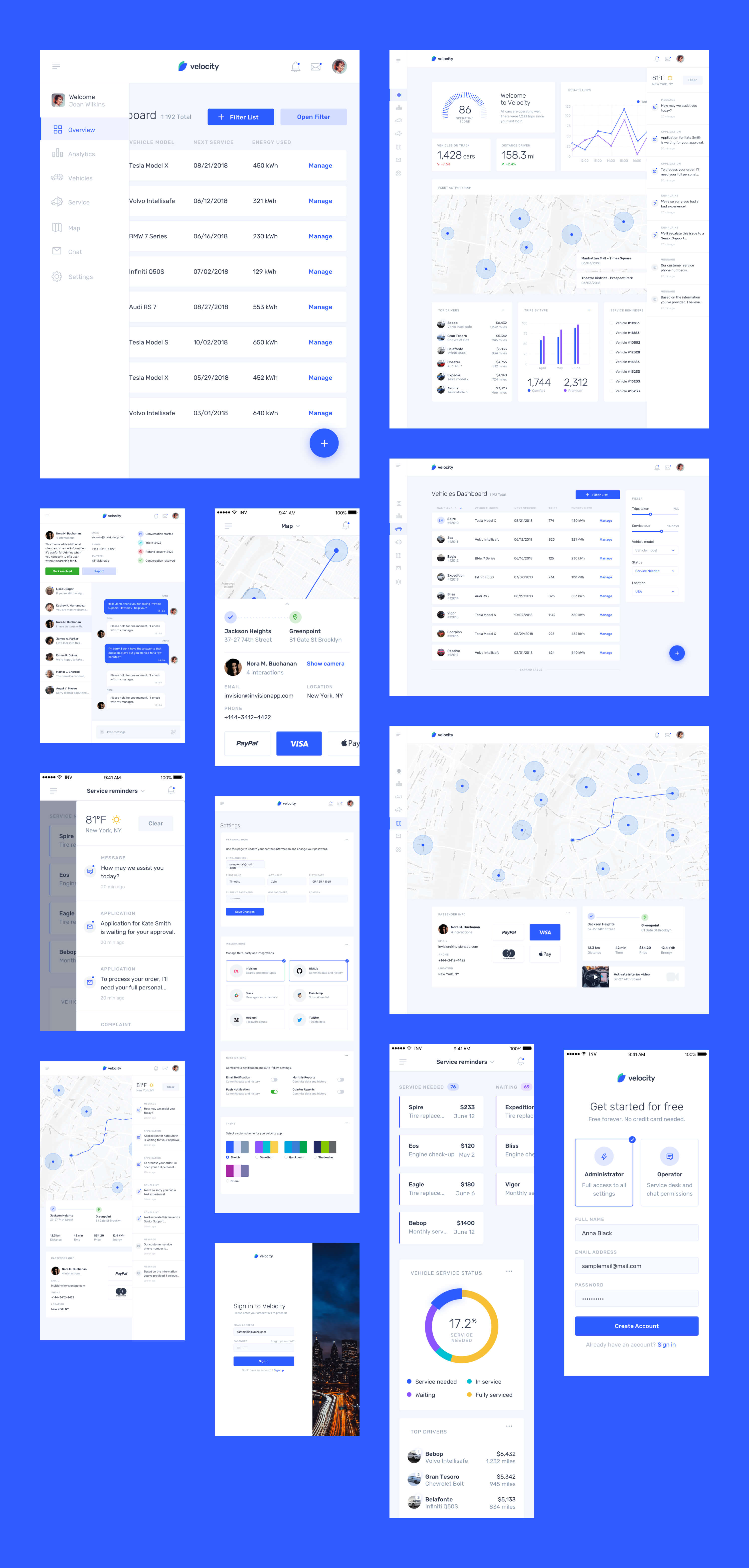
This responsively designed kit is the complete package—perfect for building SaaS apps or jumpstarting the next design system. It contains 30 screens, 70+ components, and 300+ elements.
InVision is the digital product design platform used to make the world's best customer experiences. More than 7 million people use InVision to power a repeatable and streamlined design workflow. That includes tens of thousands of organizations, including 100% of the Fortune 100.
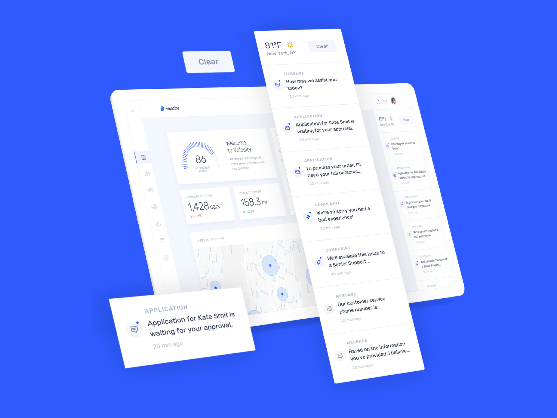
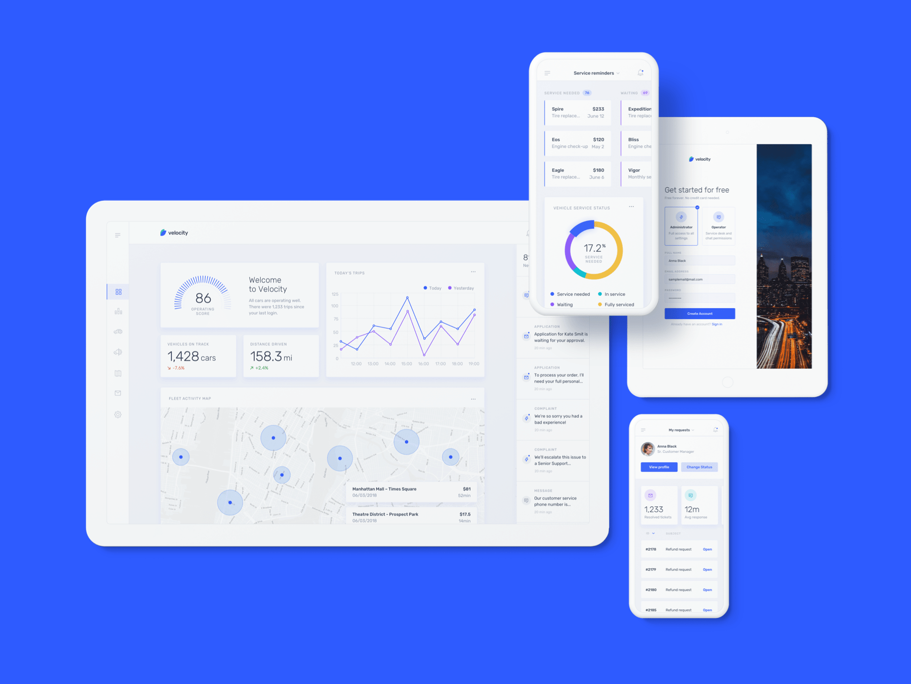
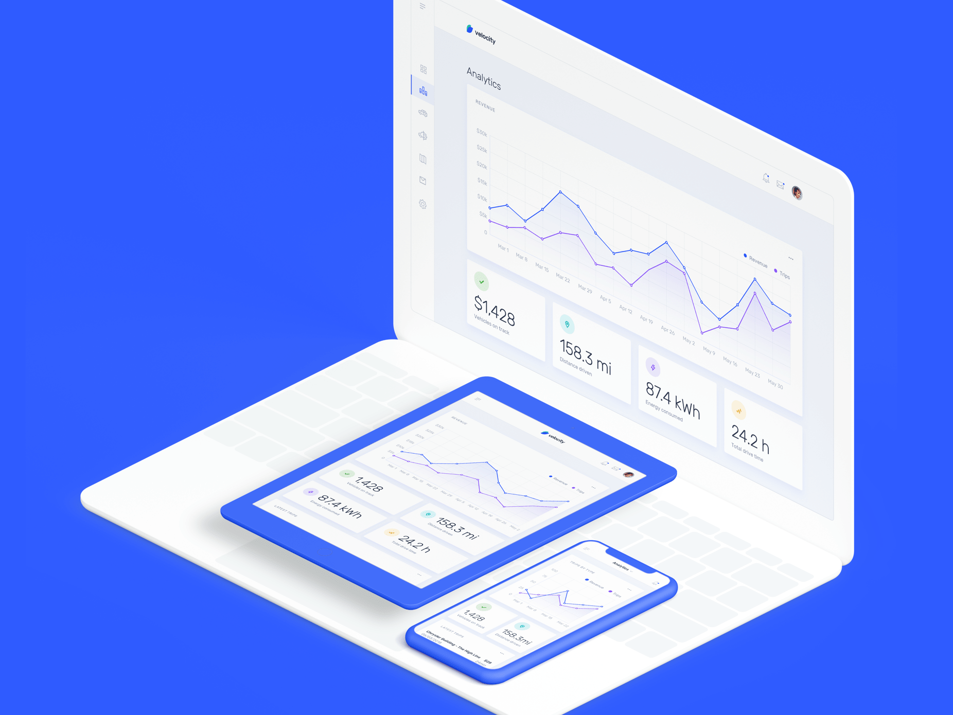
Highly customizable framework
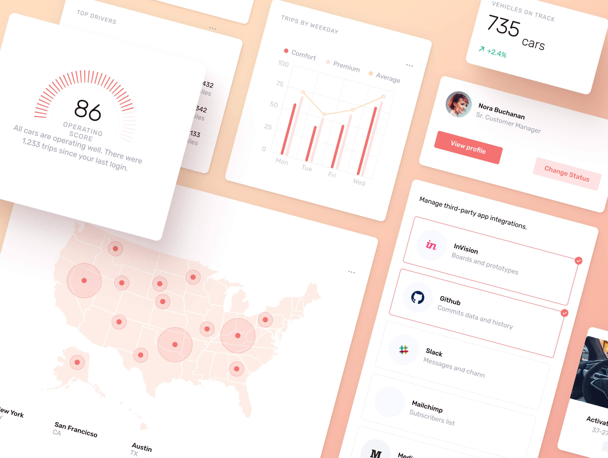
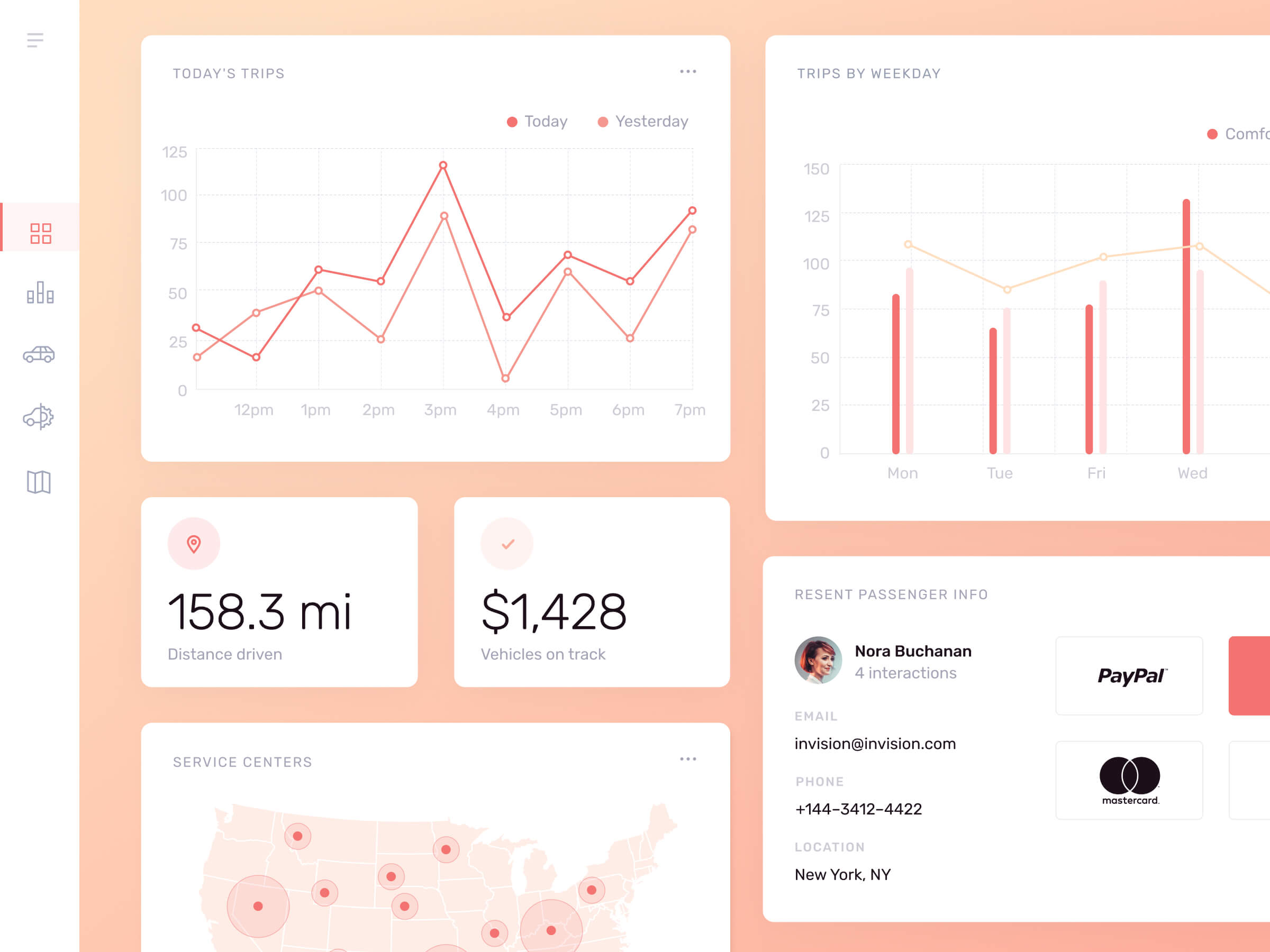
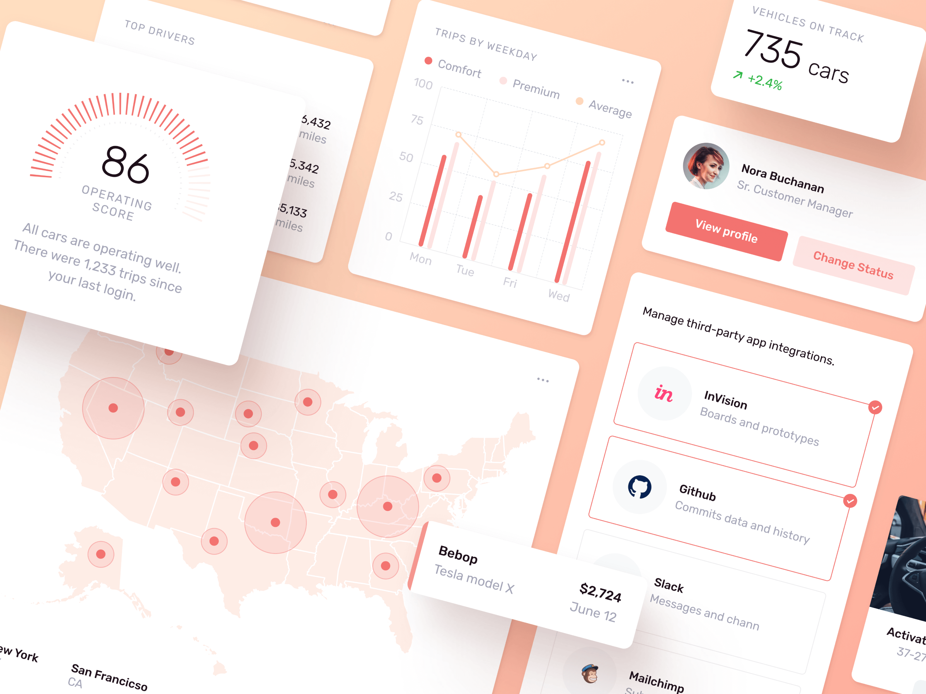
The easily customizable color scheme that’s based on nested symbols and text styles. You can use gradients, flat colors, or even images.
Voluntarily coded in React Native
Thanks to Hetmann Wilhelm Iohan, now a part of the Velocity is available in React Native for free.
Design Process
It was a special project for me, so I wanted to make it recognizable and modern-looking while technically being prepared at the highest level of detail. The project description was very broad, allowing me to make something I really want.
I started working on a key visual, in this case, it was a few screens and a simple stylesheet. This exploration stage allows me to work with the content and understand it better, while also shaping a visual design.
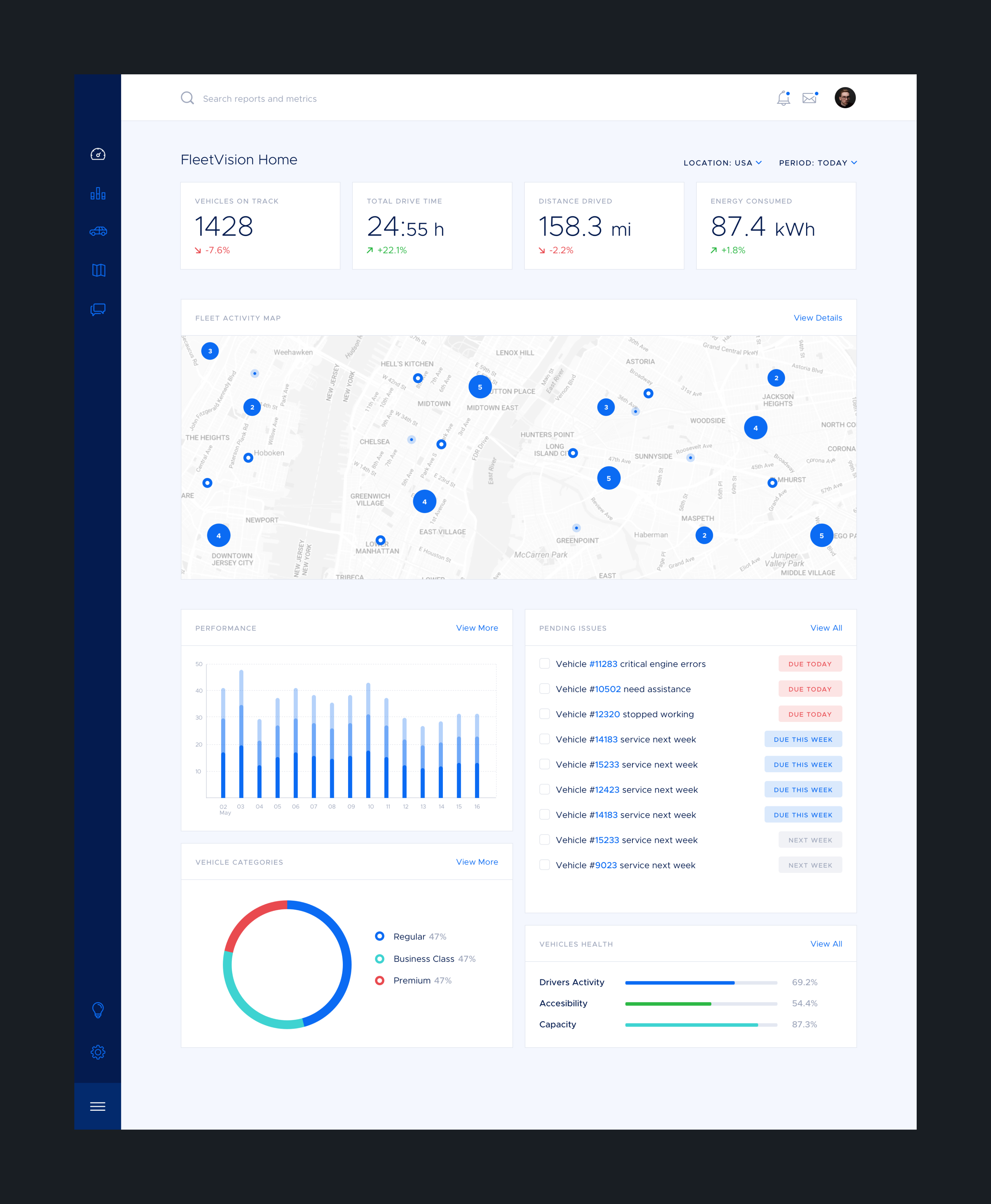
Got this feedback:
"I feel the style is too corporate. We'd like the kit to feel modern, fresh, and futuristic. While this should be an “enterprise” “saas” product, the idea is to show the possibilities of good design in that environment, rather than conform to all the expectations of a corporate product."
Completely understandable. Continue working on changing direction towards something airier, fun, and less corporate.

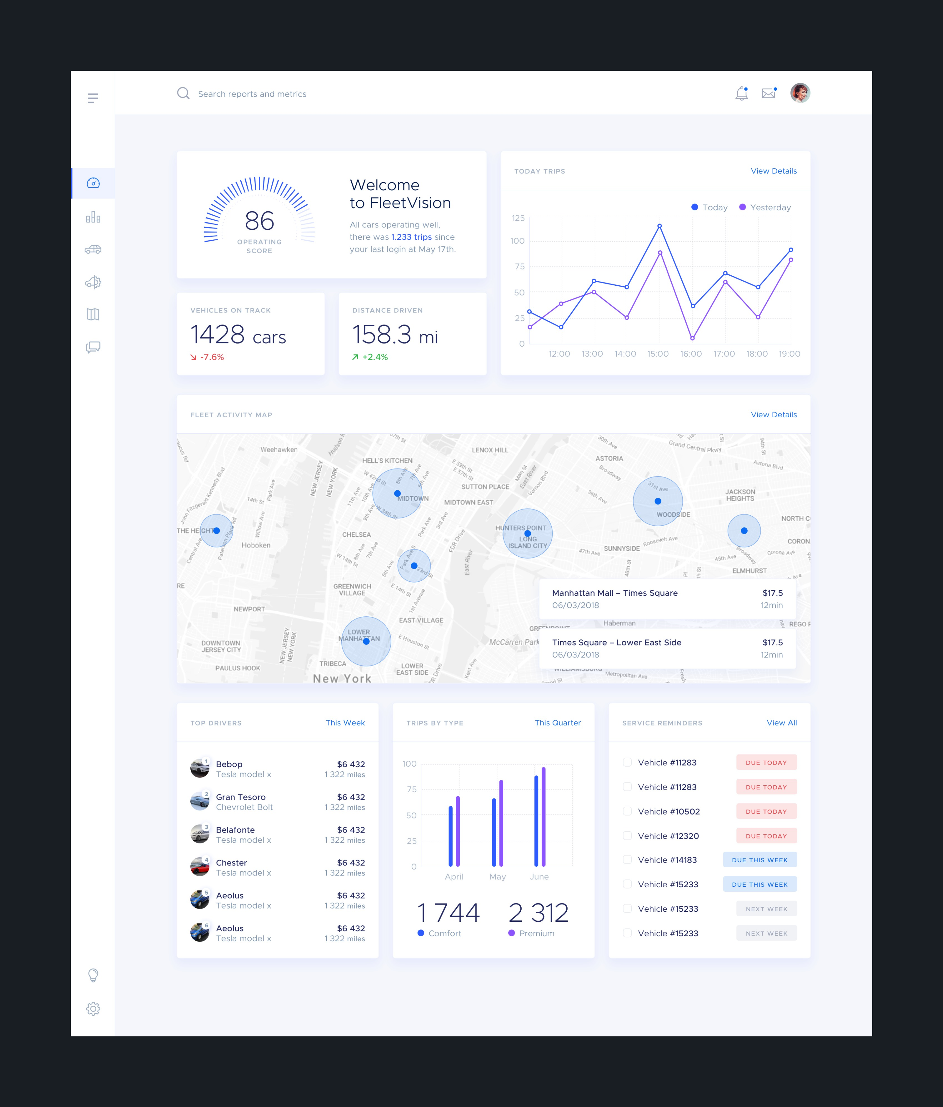
What greatly affects the overall feeling of design is typography choice. Initially, I started off with Metropolis, as a very flexible and very universal typeface. But let's see how it works with different ones:
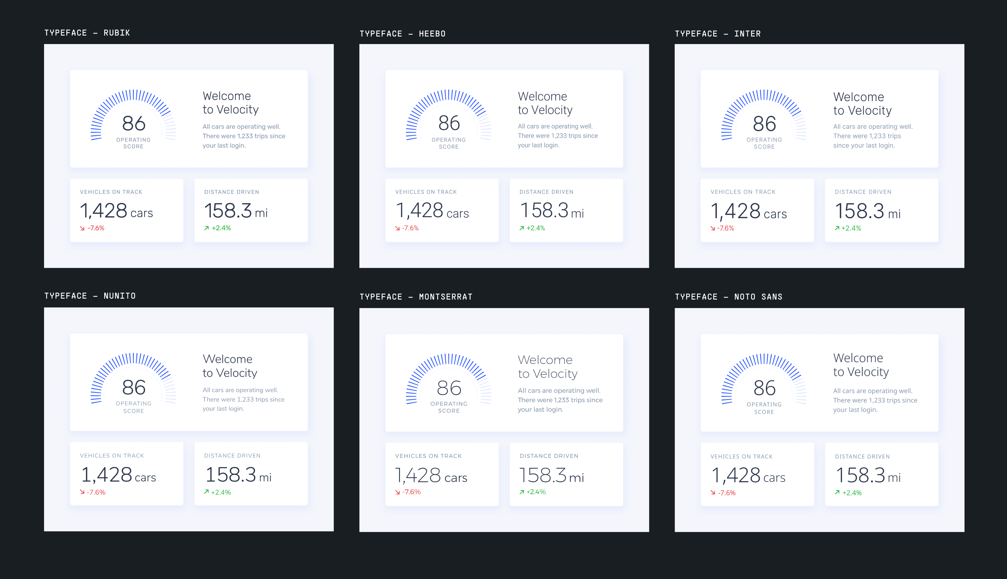
Rubik works way better with its contrast. It also feels special and quirky with its own distinct personality. Just look at that gorgeous digits. Perfect choice!
Another round of updates and short client communications. We also agreed on "Velocity" naming and I added a simple logo to match the style we already built up. It's final:
