Wrike

Timeline
2017 – 2019
My Role
Design Lead, Senior UI/UX Designer
Contributors
- Aliya Bazhaykina, Angelina Kulichkova, Christa Danilina, David Mekerishvili, Ekaterina Kalanchuk, Oksana Zabolotnaya, Sergey Stryapunin
Press mentions
- Capterra, Gartner, Deloitte, Techcrunch
Powering the modern enterprise agile
Wrike is a versatile online project management and work collaboration platform that enables teams to deliver work with speed and efficiency. Tools include planning, communication, and workflows. Millions of users at over 15,000 companies use Wrike to drive topline processes across their organizations.
I worked as a Design Lead, leading web strategy and design for Wrike’s website and marketing collaboration.
Throughout my two and half year ride I directly contributed to multiple high-impact web projects such as design system, and core marketing pages. Wrike’s design team doubled in size, and the user base grew from 1 to 2.3 million users during my time in this position.
More Than Just a Website
The Wrike Global Website consists of a multifaceted portal of various services, projects, among others–available in 15 languages, which receives more than a million visitors monthly, and which serves as the main source of new paid users.


Growing pains: Taming the Chaos
Wrike was starting his tremendous rise from a small company to an enterprise product and everyone at the company faced that. For the website team, this meant a large increase in marketing launches, new languages on the website, and a huge amount of promotional material and new projects. To control this, we needed to rethink our internal processes and find out how we can cut the routine.
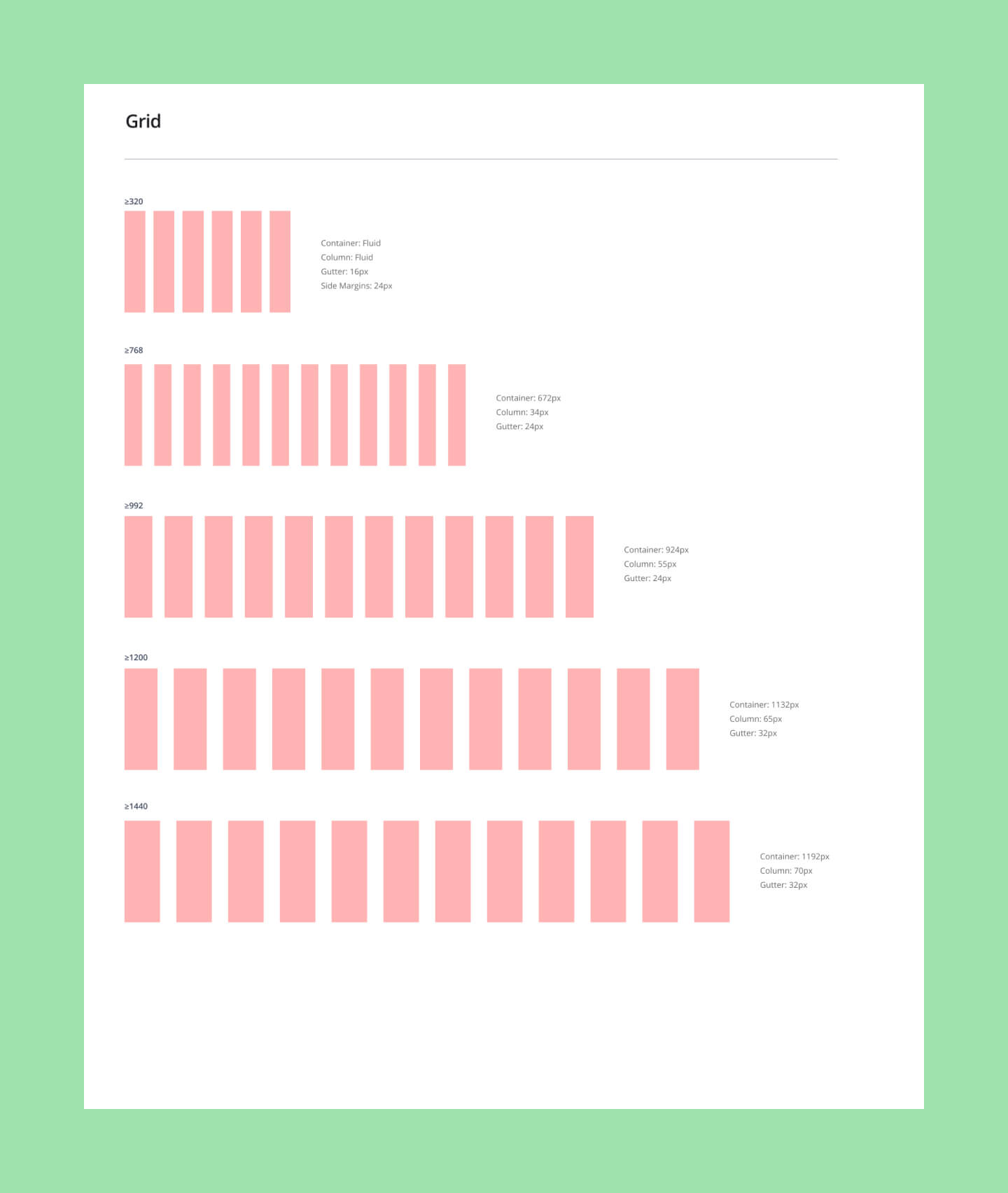
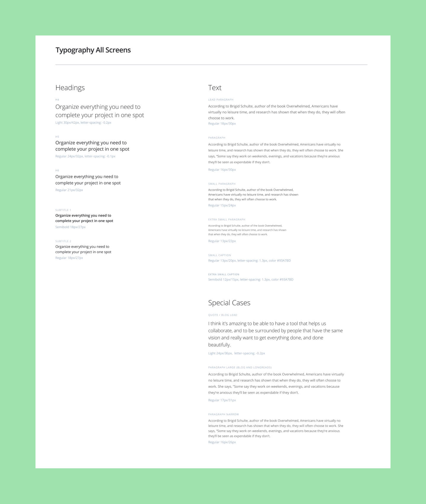
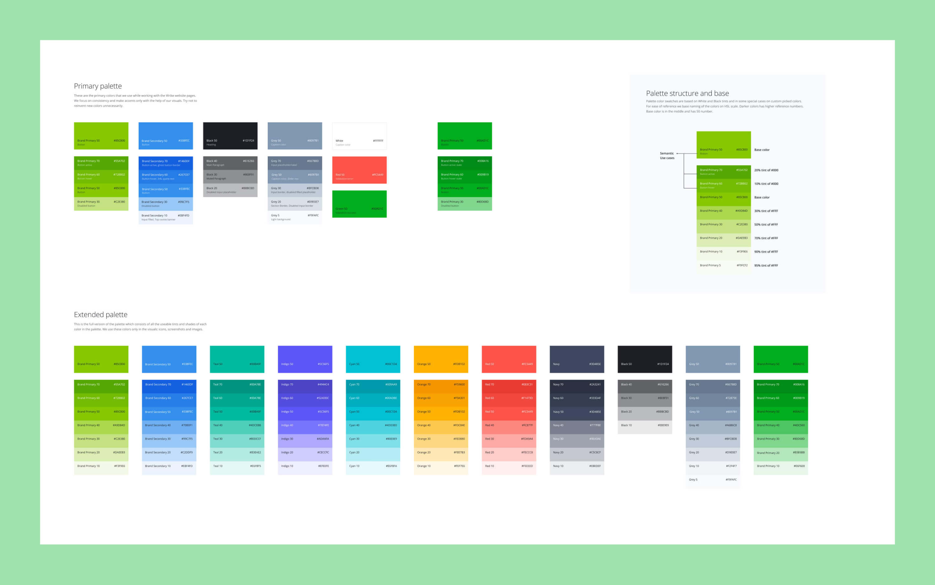
At that time, design team did not have a working style guide or design system and many things had to be reinvented on the go or copied from other design files. You can imagine how much time went down the drain with an approach like this. So the first real challenge was to make sure we redefined our workflows to be able to scale.


Design with a purpose
Each webpage we design at Wrike solves user needs and most of all, is designed to achieve a marketing or product goal.
Wrike aims to be enterprise-focused company but to stay friendly and not look too stiff. That’s why we use clean and simple shapes and typography but achieve empathy through illustrations and colorful icons.


Collaborate Conference
Wrike Collaborate is the definitive work management conference. This was the first Wrike's large event and we were working on the website for that, as well as on a part of the branding.
The promotional campaign included an interactive online website, as well as, social media templates and online banners. That was a great event and I'm happy to be part of it. More than 300 industry leaders gathered for two days of keynotes and interactive workshops with speakers like Philz Coffee CEO, Jacob Jaber, and people from Airbnb, Sony Pictures Television Networks, Zapier, and Zoom, among many others.

