As a designer, you’ve probably read a book or two about typography, colors, or even graphic design. Or maybe skimmed through dozens of random online articles. But you still wonder – how do I fill gaps in my UI skills, how can I get better?
Probably the best option is to start with basics and foundation. Learn composition, colors, shapes, whitespace, graphic design basics. But this would take you good 2 years of theory and practice. That’s a lot of time when you have a task right now and you want to be better at UI in foreseeable future.
If you’re a seasoned designer, you can still struggle with recalling and sorting through a vast repository of knowledge, especially when working against a deadline. This problem is extremely common – it’s impossible to keep up with all tips and tricks especially when you’re not using them every day.
Another reason is the product design, where metrics and actual income generation are the kings – the UI bar is falling lower and lower. Without a design leader with a trained eye and massive UI skills, there’s really little to no reason to be meticulous about the UI details.
It’s nice to have a system with UI craft improvements that would help you get consistently better while saving your time on more complex and challenging tasks. So how exactly it’s possible to speed up this educational process? Practice and systematic approach.
Exercise while reading
As Dale Carnegie said, ‘Learning is an active process. We learn by doing. Only knowledge that is used sticks in your mind.’ It’s totally fine if you don’t remember a lot of things after reading a graphic design theory book. In order to really memorize graphic theory information, you need to support it by practice. How to do it?
Let’s say you just read chapter “Contrast types” from Johannes Itten’s book. Just as you read it, open Pinterest (or a similar service) and try to find references that represent contrast types that you just read about. You can have a “Contrast types” folder or even separated folders for different contrast types – that’s on you.
Every time you come across some theory, try to support it by practice. Learning about font pairing? Try to find some eye-catchy examples and pair some fonts by yourself. Studying visual hierarchy in design? Support it by practice! Most people learn best by looking at visual examples while reading dense theory.
It’s important to note though, that in this exercise you should seek references from your field of work. If you’re a product designer working with data-heavy UI, it doesn’t make a lot of sense to save and add up posters of promo-focused works. They may be attractive, yes, but not as helpful.
Set up a reference library
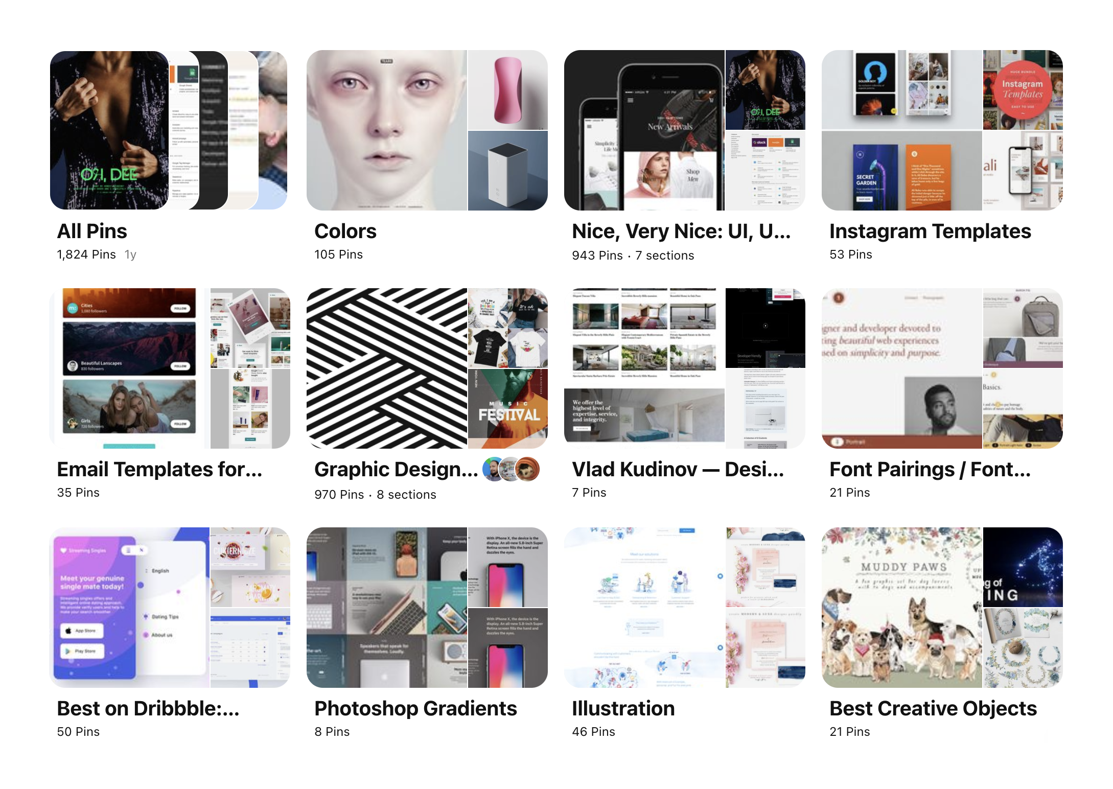
It is always nice to keep things organized — give files meaningful names and keep a structure, store them into properly named folders so that you can find them easily in the future. The good practice that should remain with you for years, is to save them for yourself by creating your own library. Collect them in Dribble, Behance, Pinterest, or anywhere else.
But just saving them wouldn’t really help. To fully feel and understand the work you like, you should work with them. References are a perfect way to learn basic patterns and how to apply them to your current and upcoming projects.
One way to is copy reference that you like. Recreating existing designs will help you get a sense of the spacing, fonts, dimensions, colors – on practice. Try to mix and match references.
Try to recreate your favorite website or app exactly as you see it. Keep attention to details and look for fonts, whitespace, colors, any element, and overall balance. Recreate the grid that the designer used in their work. Try to be as close as possible and be sure to measure element sizes and padding. Keep attention to the following:
- What is the visual hierarchy? What are the most important elements on the page?
- What draws your attention and gives you emotions?
- What is the grid that the designer used?
- What about the font, what is the type scale used here?
This would give you a lot of insights and push your design skills forwards. This is an extremely effective approach that painters used for decades. It’s sort of a reverse-engineering of visual work.
Another important exercise is simply asking the same questions for any reference. What really works on this specific website? What jumps out to you? Why did it catch your attention? Write your notes along with the reference in your library.
Study designers that inspire you

Every design work is sort of a remix of someone else's work. Everyone got inspired by something and someone. Nothing is completely original. Design history and theory in general certainly would give you a great peek into the evolution of ideas and techniques.
What is tactically important about that is the fact that you’re favorite designers has their own favorite designers and so on. If you’ll climb this tree of references, ideas, and works you would find great inspiration. There’s great power to that when you reach some foundational work and see why and how it was transformed.
One of the most obvious examples is the Apple design and Braun as their main source of inspiration. Dieter Rams works deeply influenced a lot of designers and the world in general. If you’ll look into the Bauhaus and Swiss design, you would see a lot of techniques that exist in the modern web and are widely used as a standard.
The importance of design history is greatly underestimated. There are so many great ideas waiting to be remixed and used in new ways. More than that, understanding relationships between different people and their design would give you a greater context across time. You would see and understand patterns and the repetitions in trends.
Other designers may have worked in different mediums than you, but really they were solving the same problems of communication that you have to solve today. Learn from the master and work that lasted through the years.
Dive into UI tips

One of the real hacks that you can do is to study and reuse UI tips. They wouldn’t give you a lot of context and don’t help with solving a bigger problem. But it’s a great place to refresh your memory and consume some bits of knowledge. There are lots of UI tips resources right out there, and they cover a large number of design fields. Here are some of the best ones:
Bunin UX
https://buninux.com/learn · Free
Dmitry is a designer-entrepreneur who creates and sells superb UI kits and icons. He’s very meticulous and always gets to the root of the matter.
Jim Raptis UI Tips
https://www.uidesign.tips/ui-tips · Free
Practical library of UI/UX tips presented in an easy-to-digest way along with thoughtful articles and newsletter.
Typewolf Checklist
https://www.typewolf.com/checklist · $399
Typewolf is a fantastic resource for everyone who loves Typography. It’s an endless source of inspiration and guides. The latest one is maybe a bit pricey but has all answers to anything related to the typography.
Refactoring UI Book
https://www.refactoringui.com/book · $99
Adam, as he describes himself as a ‘full stack developer who used to suck at design’, published a book where he described in detail the basic principles of creating a beautiful UI. A lot of tips were previously shared on Twitter.
Repetition is the key
Practice makes perfect, there are no shortcuts in UI design – it’s all about time and repetition. Keep learning to be better at your UI game. Read books, study designers and their work, and do as much practice as you can.

